Summer Projects

This was the project that said to draw a collection of glass bottles. I really tired to make an interesting composition, as well as do some studies on how to draw fabric. I used oil pastel for this because I felt like it would be the best medium to easily blend the colors together to make it vibrant and enticing. This was the first project I've ever done with oil pastels and it was hard to stop for a day and come back and try and finish it. The oils would harden and it made it harder to add layers on top of the existing oil I put down the other day. I enjoyed setting the highlights and making the shadows as well, it really helped bring it to life.

This one was based on the topic "unusual interior". I took this picture inside a Flicka, a boat that I really like. This was really hard because I've been away from pencil drawings for so long, and I really struggled making the values as neat as possible without smudging them with the palm of my hand by accident. I really tired to make gradual values without a tortillion, and looking back on it, I wish I would've made the values darker to really bring out the highlights. I wanted to add a little pop of color, because the outside of the cabin was just white light, which I felt would be too boring to do by shading. I ended up improvising a bit and making up my own exterior of the boat. I thought adding the color would really make it pop and stand out from the rest of the boat.

This was my self portrait. At first, I was really shaky on doing any sort of human beings, since I usually struggle drawing people. I decided to do it anyways and just see how it would turn out. One of the things that was the hardest was trying to match my skin tone. My skin tone has a yellowish tint to it, so it was really hard to find a color that matched. I ended up having to just layer tons of colors on one another to make it somewhat close to my actual skin tone. I really like what I did with the black marker when I added my eyelashes and eyebrows. It helped them stand out and become sharp and distinct from the area around them. I really wish I would've spent more time making the nose. It's lopsided and too small in comparison to my face. I also wish I would've practiced more on hair, since the hair I made doesn't look quite real to me. Overall I think this turned out alright!

This was another of my projects that was supposed to be a mixed media portrait. I used watercolor, acrylic paint, and the mixed media element to help create this. I was mostly inspired by Pocahontas, so I wanted to create something along the lines of that. I also tried to do something a little abstract, as I have a really hard time thinking about how to do things in an abstract manner. It really bothered me how the colors weren't perfectly blended but I think it ended up looking somewhat abstract and interesting. I really had to create some movement with her hair to make it look like the wind was coming from behind her head. The pink really brings out the streaks in the hair and I think that it really helps it pop. The collage element was somewhat hard because I had to use a hot glue gun and I ended up burning myself a lot. I really gained some experience in mixed media and abstract work.

This was one of my mini concentrations. This is a pangolin, which is an endangered animal. I wanted to focus more on endangered animals, since I feel like people should be more aware of how little there are left in the world. I did these with prismacolors and on black paper. Black paper was actually really hard because I couldn't really see where I outlined all of this. I also really tried my best to make the background look densely forested instead of scribbles. I really learned how to create shadows and highlights using these pencils, as well as creating tree bark. I like the composition that I made with most of the animal on the right side of the picture; I tried to incorporate the rule of two thirds. Overall, this was a really fun piece to color in and I learned a lot about the way prismacolors work and how to blend them effectively.

This was one of my other projects that I decided to pull as a summer project. I used prismacolors to help create a secretary bird, who is also on the verge of extinction. This was one of my first times using prismacolors and I really had to experiment using the tints and shades. I think the hardest part about this was getting the feathers. I tried not to draw each feather individually, so it ended up looking a little sloppy. I also struggled to create the background. I really had to think about general colors and make a splotch of green where the light would be hitting. It was really hard for me to do because I didn't really have a reference and I don't usually draw things out of focus like that. This is really the project that got me into prismacolors.
Project #1- Reflection Project


This reflection project was actually really fun. I decided to do a ship in the bottle reflecting my aquarium. The ship is really special to me because my dad gave it to me when I was about 6 years old after my first real sailing trip. The trip was great but we had horrible weather that caused me to be sea sick. So, my dad gave me this at the end for keeping it together. I also really love fish, which is why I reflected my aquarium in the background. It's almost like the boat is kind of under water.
I ended up having a lot of problems with the beginning part of sketching the layout. I used a new technique where you sketch the outline in colored pencil, so it'll layer easily over the outline instead of smearing like graphite does. I always had that problem when I did colored pencils before, so it was nice to learn a new skill. I no longer have to erase my outlines to begin coloring! I also learned how to add new highlights to make sure that they really stand out, instead of adding them last. You almost have to draw all of the details first and then go back and add all of the general things to make sure the highlights don't get layered under. The part that was the hardest for me was the reflection at the end of the bottle. I had to distort it and really focus on what I saw in the picture rather than what I think I saw. I had to look at things as shapes and lines rather than the whole picture itself. It took quite a long time to get everything the way that I wanted it; mostly the pebbles. I had to shade and highlight each pebble and that alone took about one whole class period. Another thing that I encountered was the background. The background in the photograph is kind of a greenish grey, so I had to layer greens and a light grey to make the background. I don't really think it looks quite right, but I wasn't sure if there was anything else I could do.
Overall, I really learned a lot from this project. I mostly learned patience, because before I would always rush my projects to be done before everyone else. I now know that you really have to take your time and work in all of the details before you can really improve. My favorite part would have to be the pebbles on the bottom of the aquarium floor. They took me a really long time to finish, but I think the outcome looked pretty nice. It almost adds some depth to the drawing.
Every Day Items Project


This project was overall very challenging for me. I'm not very skilled with painting and it bothers me how I can't add of the small details that I wanted to. There were so many tiny details I wanted to add, but my hand wasn't steady enough and the paint was still wet. There are still many things that I would change about it. I would've changed the wood to make it look more realistic, added the patterns on the two tea kettles, added something in the background, and pushed the values more than I already did. I also would've made all of the colors more distinct and different; all of the blue pots are clustered together and towards the center of the canvas. For the wood, I would've put slabs of wood to add depth to the picture instead of doing the pattern like I did. I would also add darker shadows around the pots to help make them stand out.
I also struggled with time. I found myself rushing a lot trying to get the colors to match what I saw in the picture. I spent too much time blending the colors to the point where everything blended together to just make one color. Everything began to turn the same color because I was too focused on blending and the paint was still very wet. I tried to layer the colors, but it would just all turn into another color that didn't quite fit the picture. Next time, I should really take my time and worry about brushing up all of the technical blending for last.
From doing this project, I learned to not always focus on blending colors together when you're doing an oil painting. It's ok to add some blotches of color here and there. I also learned how to not do wood in the future as it was not very appealing. I also noticed how I should try and map out my colors a bit more before I started a painting to make sure the colors aren't too similar to each other in one spot. Try and spread out the colors to make it more pleasing to the eye.
Strange Interior


For the interior space project, I decided to do the inside of a doll cabinet. I chose this because my mom has collected dolls ever since she was a little girl, and every Christmas my mom would get my sister and I new dolls. We were never allowed to play with them since they were collectibles, so they always stayed inside the doll cabinet. I was nervous about doing this at first because I don't usually draw people well. I had to erase a lot and redraw a lot of the sketch to get her expression right so it wouldn't turn out looking creepy. I also had problems with hair since whenever I try to draw it it never turns out well. But once I added highlights and shading in the different strands of hair, it didn't look too bad.
I really struggled with the background because I had to completely rely on the picture for what the background should look like. For most of my other drawings, I would make up a background or kind of edit it to my liking, but for this one I couldn't do that. I had to draw everything quite literally and even draw things that I didn't quite understand. For the doll on the far left, I couldn't really see what it really looked like, so I just had to draw what I saw and hoped that it looked okay in the end. This was also true for the orange and yellow background.
From doing this project, I learned to not always use the colored pencil blender. Before, I used to rely on it so much. I would almost barely manually shade and use the pencil to blend everything. I didn't use the blender for this whole piece, and it helped make the colors look more vibrant. The blender tends to take away the color and make the colors dull and less interesting to look at. I resulted to blending everything, finding the highlight and shade color and then use the middle color between the two to kind of act as a blender between the two. I think this helped it look more real and made the colors really pop! I also learned to draw the sketch background using a white prisma color. Before, I had a lot of troubles trying to layer colored pencil over the actual pencil so once I learned to use that skill it made a lot more sense. I could easily begin coloring in the picture instead of erasing my sketch first.
Mechanical


Prismacolor Challenge
This was a drawing that I did for the Prismacolor challenge, were we all had to draw a part of a standard picture that they chose for the challenge. I didn't know that we had to post pictures of these, so I didn't take any in progress pictures. Overall, I had problems with drawing straight from the picture. That one pumpkin on the bottom left looked really weird in the picture so I had to really scrutinize the overall shape of it and its colors. Same thing goes for the gord in the middle. I had to draw weird warts on it and things I didn't quite understand to make it look as much like the picture as possible. I also had problems with the top left pumpkin. It was one of those white pumpkins but I had problems making the values work but not make it look orange. I also drew that before the flowers, so It looks kind of out of place and unshaded. Another thing I had problems was pushing the values on the pumpkins. I tried adding blue or purple, but I already added so much red that the end result made it look really bad. I discovered adding dark browns really worked if you layered it with some blue or purple and helped add depth to the pumpkins. I struggled with the flowers too, because there were just so many of them I couldn't take my time to draw every individual one. I ended up finding some sort of pattern that looked somewhat like flowers to make the process a bit faster and easier. Adding white to the flowers as well really helped them pop. Another thing I had problems with was the wood. I had problems making the values really dark under the pumpkins, so I found that layering brown, blue, purple, and maybe a little of black helped increase the contrast between the wood and the pumpkins.
Through doing this project, I learned that adding some black isn't always bad. I used to only use blues, which was good, but once I needed a really solid black, the blues I used didn't really cut it. I had to try out the dreaded black colored pencil to really make the darker parts as dark as I wanted them to be, and I don't think it made it look too bad. Overall, I really liked this project because it was back in my safety net of colored pencil, and although I've done a good amount of colored pencil projects I learned a lot from this one project.


Landscape Project
I really liked this project, but I want to come back to it later and touch up on my values. The water looks a little bit too light and I wish I darkened up the blue values and really emphasized the reflections in the water. It was hard to try and reflect the mill in the water since blue and brown dont really go together well, so I ended up just adding some light shades of brown into it. I also wish that I spent more time making the trees more vibrant and captivating, as well with the grass. I feel like I could've really pushed the values on everything and I'll probably touch back on it towards the end of the semester. I do like what I did with the mill, but I feel like the shingles on the roof are off in perspective. I always have problems with rooftops and they never quite look right to me, so that'll be something I have to practice in the future.
One thing that I really had problems with was adding too much water on the paper. Sometimes I would be trying to add too many values in one spot and they'd end up all blending together and making a really ugly brown and the paper would start balling together and peeling off. In the future I should try and add less water to the paper and maybe layer the colors overtime to avoid them all blending together. I also feel like I just got lazy with the project and I really wish I hadn't. You can see how the grass got much less defined as you go towards the left side of the page. Same goes with the trees. I also needed to add a definite darker line to distinguish between the grass and the trees to add more contrast and really make them pop.
Overall, I like this piece that I did but I wish I would've given it my all. I like the mill and the colors I used in the trees, but it just doesn't look appealing to me. I'm glad that I was able to paint a place that had a lot of significance to me, though. Every year my family goes to this mill, Mayberry Mill, and have breakfast with my grandparents for my mom's birthday at the nearby restaurant. It's the most photographed spot on the blue ridge parkway and being able to paint it was great!


My first attempt at a concentration piece
This project was really hard for me to do. The paper I used was great for watercolor, but the colored pencils would not blend at all on the paper. I had to add many many layers and even after the paper was filled with the wax of the pencils, I still wouldn't blend. I guess that's the trade off for using all purpose paper. I really had to focus on the colors that I used and try not to use a heavy hand if I was doing a really dark color. I also had a hard time with the boots. I tried to make them look rubbery and have that slick look to them, but also folded in some areas to give them the appearance of being old and worn in. Most of the boots that I used as references didn't have any folds in them, but when I practiced and shaded in the boots like the pictures, it ended up looking very 2-d and not very dynamic. I feel like the boots look a little strange and I wish I would've had the folds continue to the outline of the boots so they'd look more 3-d. The reflections on the boots were also hard since I had to use greens and blues on top with the not very blendable paper.
I wish I would've done all watercolor so I could layer the boots and really shape them to the way I wanted. I also wish I would've focused more on perspective since the boots look way too big. In comparison with the sidewalk. The gutter also looks a little warped in perspective and I wish I would've spent more time sketching and making sure everything looked right. This was my first time doing anything in grey scale, and it was really hard to push the values but make sure to add contrast between different things. I feel like the road shouldn't be that light, but adding anything too dark may drown everything else in the picture.
There are some thing that I like in this picture. I really like the toes of the boots and how I used a lighter shade on the tips of the toes to give them more depth. I also really like the folds in the jeans, its almost like you can see the knee beneath the clothing and I think that's really cool. The tree in the background was also something that I think I did a good job on. I like how you can see the bark and the values around it. Overall, I definitely learned a lot from doing this project even if I don't think the end product was very successful.


Concentration Piece #2
For my concentration I finally decided to do pictures that reminded me of my childhood. This project was pretty fun to do, but it took me a very very long time. I had some problems with the bubbles since I've never really drawn bubbles before. I had to study them a lot and practice a ton before I started my final piece. I also had some problems with how long it took me to do this. Overall this project took me about four days to do. The third one I spent about six hours filling in the bubbles and making them as good as possible. I had to shade every single bubble and I found myself getting lazy and just rushing to finish. I also dont think the background, like the tub and the wall, looks very good, to me it looks very bland and I feel like I could've added more colors to make it look more vibrant. I really wanted to add more tiles but I was running out of time in the end and I was getting a little lazy. I also used a ton of colored pencil and I had problems layering them as well. Next time I should add the colors more carefully.
I do like the colors I added in the duck and in the bubbles surrounding it in the reflections. I also like the details I added in the duck and how I especially focused on the highlights. I think it overall turned out pretty well, but I feel like it could've been better if I didn't rush and spread out my project over maybe a week or so instead of leaving it last minute. I felt like I didn't have enough time and I worked on it too much in one day so I did a sloppy job.
Overall, I learned a lot from doing this project. I learned to spend more time planning the project and maybe sketching it out more. I also learned to not leave things at the last minute and to spread out my time more so I don't feel like I have to rush my project. I also maybe wanted the make the piece more dynamic because I feel like it looks a bit like everything else I do. The layout and the design of this project seemed boring to me and I wish I made more thumbnails. However, I do really like the way it turned out and I really like the colors I used and how they all work together.


 Concentration #3
For this piece I really wanted to do something that I loved as a kid, stuffed animals. I tried to incorporate a lot of stuffed animals that I played with a lot when I was young to give me more motivation to do this piece. It's not quite done yet since I need a background, but I decided to take a quick break from it so I could come back to it later with fresher eyes. A lot of people said I should put a bookcase in the background or even put them on a bed, but I'm still not sure that I wanted to do yet and I decided it would be best to just come back to it later after I get more feedback from everyone else.
Overall, this piece was really weird to do. I had some problems with the fur as it took me a really long time to do. I wanted to make them look more furry and plushy, but I feel like they just look really hairy instead. I dont think I captured the fluffiness of the stuffed animals and looking at it really frustrates me. I also had some problems with adding black. I usually never use black since its so harsh, but I had to try it out in this piece. Goofy was supposed to be black, but since I was so wary about that color he turned purple instead. The panda in the back is also a mix of black and purple but I really tried to use more black in order to make him actually look right. I also dont like how I had the panda and the bunny so close to eachother. I feel like they somewhat clash because their colors are so similar and it sucks I didn't notice it until after I had finished. Another thing I don't like about this piece is the bear. I feel like he looks a lot like a koala since his nose is so high and it doesn't look like the picture at all.
Overall, next time I think I should sketch more before I draw. This would ensure that the perspectives dont look so strange. Also, I think I should plan more before I do a piece so I won't get stuck with the background like I did here. I thought I would come up with something as I was working on it, but it only made me more and more stressed out. I also should use different paper next time, as I used paper that's not really meant for prismacolors and you can really see the grain in the paper if you look closely. In order to make the bears look more fluffy, I think I should focus more on smaller strokes and maybe try to add strokes that are not all going the same way to give it more depth and dimension. Overall, this project was okay, but I still see a ton of things I could've done differently and I dont really like the way that it turned out.


 Concentration #4
This piece was really fun to do but really hard with the medium I was using. I wanted to do something that I really enjoyed as a kid and that would mainly be sailing. These are the boats that I first learned how to sail on in Oriental and it was really awesome to be able to paint them. This piece was really hard for me to do since I never really paint. Of all of the pieces that I've worked on this year this one by far took me the longest, I practically worked all weekend on it since whenever I paint, I always see small mistakes that I would like to fix, and then when I fix it I mess something up in the process. It's quite frustrating.
I think this piece turned out okay. It's not my favorite, but it was really hard to get the perspective right with all of the boats. I had to spend a lot of time sketching everything out and using a ruler to help me make all of the lines straight and make all of the boats look as uniform as possible. To me, all of the boats look wonky and out of place. I feel as if I didn't do a very good job sketching them and the perspective doesnt look quite right. I hate how some of the boats look fatter than others, or some look longer or higher than theyre supposed to be. I also really dont like the bottom right boat that kind of blends in with the grass. I wanted to make that one orange, but I felt as if I had too many orange boats and not enough of green ones. In the picture it was gray but I was just tired of doing gray boats. I also don't like how some of the wood frame got a little wider since I kept going over it, and I feel like I really rushed with the grass.
Overall, theres a lot about this piece that I really don't like, but I feel like it was somewhat sucessful since I almost conquered my fear of painting. Next time I should take my time and take it slow before I jump into a painting, and I should also plan out my colors before I start. Upon doing this piece, I learned to just go for it. Even though all of the colors arent quite blended, I tried to let myself go this piece and not worry too much about making everything perfect. Sometimes I added a block of color and I ended up liking the way it looked- everything doesnt have to be blended all of the time when you're painting. I feel like this piece really helped me understand my painting style and got me on the right track if I ever wanted to paint again.


Concentration #5
Although my concentration is my childhood, I tried to add some more unconventional times that I had as a kid to make my concentration a little more personable. I wanted to make something that really shows how I grew up, instead of the general population. This sailboat was really hard to do because of the perspective. I found it strange to draw from this point of view, and I really had to sketch it a lot in order to get the perspective correct. I also had some problems with the colors in the picture. I feel like there was too much blue and doing the cabin made me feel like the blue was just overwhelming.
I struggled a lot with the water. I really wanted to show movement in the water and how the water kind of flowed with the tide- I didn't want to make it look dead. I tried to add a lot of these movements and adding plenty of values, but I feel like it just ended up looking murky and strange at the end. I also really struggled with the colors in the boat, since they're mostly tan and white. In the picture, a lot of the boat is very white due to the sun, but I really wanted to show the details in the boat and I felt like making it all white would've been very confusing. I also feel like I could add more values into the sail to make it look like there was wind. The part I dislike the most about this picture is the cabin. In the picture it was completely black, but I felt like black would've been too harsh. I had to resort to using different blues and purples and that is personally my least favorite part of this piece.
Next time I think I should plan my colors a little more carefully. I feel like I was trying to rush this piece and all of the blues makes this a really weak project in my mind. I feel like everything blends together and nothing really stands out. I also think I should work more on my techniques with water since I feel like the water looks very bleak and still. Overall, I think this is one of my weaker pieces and I wish I would've spent more time thinking about the colors before I started it.


 Concentration #6
I really wanted to do a piece that showed how much I loved gaming as a kid. Although I feel like I could've done this better, I still really like the colors in it and I like how they all work together. I also really like the small details I added with the gel pen since I think it makes the brighter highlights really pop to make the piece a bit stronger and almost give it a more playful feel. I also really tried to add a lot of purples and blues to emphasize the highlights and I ended up really liking it. I also like all of the shadows I added under the cards to make them almost come off of the page. I actually didnt mean to add purple to the gameboy color, but I like how it works with the blue in the device, I feel like it helps make it pop.
There's many things I would change about this piece. I don't really like how the game cards are kind of warped and I wish I would've used a ruler to make the lines more straight and uniform. I feel like some of my lines are kind of wonky and doesn't look quite right. I also wish I wouldn't have gone so small because I had a lot of trouble adding really small details to the game card. I couldn't get my colored pencil sharp enough to add the small words that were on the card or even the logos on it, and I feel like if I could've added it, it would've made the piece a lot better. I also wish I spent more time working on the carpet. I feel like it just looks like a fuzzy ground instead of actual carpet.
Next time I think I would've gone bigger so I could've added larger details or maybe even use a gel pen. I also would've used a ruler to make the lines look a little bit more uniform so the perspective wouldn't be a little thrown off. I would spend more time working on the carpet and maybe add some carpet coming around the games to give the ground a little more depth instead of it looking so flat. Overall, even though there is a lot I messed up in this piece, I actually kind of like it because I love the colors and how they work together.
 Concentration #7
I did this piece because I played with trains a lot when I was little. This is my old train set and I really had to dig around the attic to fish it out for this photo. I feel like this piece was somewhat successful, but I used the wrong type of paper. This made using prismas a lot harder. I had problems layering the colors, especially yellow and the brown I used for the rail road track. I feel like this piece doesn't quite fit with my other pieces and you can kind of see where I gave up in this piece.
I really like the highlights I did in the train and the bridge. I also really like the ferns in the background and the shadows I did on the blue tower. The wheels on the train took me a really long time and I actually like the way that they turned out.
I wish I would've used a ruler when I did this piece. I didn't really plan and just kind of went for it, and you can really see the messed up lines in the background of the piece. I also had some major problems blending the yellow blocks. I've never really had to shade yellow before and finding a color that would act as a shadow of that pallet was pure death. I tried orange but that just made it brighter, and the brown I ended up using didn't blend well with the yellow. I had that same problem with the track. I feel like I couldn't quite find the correct colors that would compliment the track and you can really just see the strokes of the pencil that I did. I also hate the background picture on the wall. The building was supposed to look more realistic, but I feel like it just looks like a child's artwork in the background. Overall, I feel like this piece could've looked a lot better if I had planned more and spent some more time on the background.

I did this piece because of my Asian heritage. It really helped shape who I am today. I have pumpkin seeds, the Taiwanese flag, red envelopes, and flowers. These are all things that helped make up my Chinese culture. It took me a really long time to photograph this picture because I thought way too much about the composition of the piece. I second guessed myself a lot and I tried tons of different pieces and placements of everything before I got this final product.
I think this is one of my weakest pieces. I really don't like how I messed up the envelope perspective. I feel like it is somewhat warped and doesn't quite look right. I also don't like the seed. I feel like there's no dimension even though I added tons of shadows under them. My least favorite part is the flowers. They're very 2-D and do not look good at all. They do not have any depth and I barely added any highlights to them.
If I were to do this piece again, I would really work on the perspective of the envelope before I started coloring it. I also would've spent more time planning out the seed bag and the flowers around it. I would've added more color to the flowers and added more shadows and highlights, and maybe exaggerated the shadows under the seeds to help them stand out even more. I would also maybe take a gel pen and to add the highlights to help things stand out a little bit more. I also would've spent more time on the wood behind the bag. It was originally granite but I thought wood would look better. Overall, this is a really weak piece. I feel like I almost was too lazy with this piece and I could've made it look really good if I just took my time and really focused on all of the small details.


I really wanted to do this piece because my cat was a really big part of my childhood. I've had her since I was three years old and I feel like my concentration wouldn't be complete without her. I did this piece on orange paper, because I wanted the viewer to get a sense of warmth from the sun and the happy demeanor of my cat. I'm very glad I did that because I was able to quickly do the wood grain by letting the orange somewhat shine through. I also love the texture I put into the cat and the shadows on the house siding. I also like the purple I put in the cat to enhance the shadows and add some depth to the piece.
I wish I would've spend more time on the perspective. I feel like it is somewhat warped and the cat looks too big for the background. I also wish I would've spent more time on the wood on the left side of the piece since it looks bendy and not really straight. If I was able to do this piece again, I would've fixed the perspective and maybe fixed the cat's muzzle since that looks a little bit too long. I feel like it doesn't look quite like my cat due to the longer face. I also would've changed the color of the curtains because I feel like the blue doesn't quite go with the color scheme. I wish I would've made them purple as it would compliment the orange in the wood.
Overall, I think this piece was pretty successful. Even though there are many things I would've improved, I still really like all of the colors I put into this piece and how much time I spent on the fur. This was the first time I really let the background color of the paper I used shine through my art and I think it turned out really well. It almost gives it somewhat of a glow. I also like the green leaves I put behind the railing because its gives a small pop of color that I feel really bring everything together.

I thought this was a good choice for a final piece. In this, I have my old house in the background for sale and my graduation tassel hanging by the mirror. I also have the interior of the car I used to move stuff and my street in the background.
I really like how I did the house. It was hard to get all of the lines straight, but I think it ended up really looking like my house. I also like the interior of my car. It was hard to get the right pigmentation right of the car seats, but I think I handed it somewhat well. I also like the trees and the slight distortion of the windows from the car, as well as the values on the tassel and the little flip thing on the window.
Next time, I would've taken more time on the background of the piece. I feel like I really rushed the trees and the stop sign looks a little silly. I also would've added more values to the road because I feel like it isn't just grey. I feel like there should be much more black in the piece but I still wanted it to stand out from the mirror. I also would've made the interior of the car more interesting, maybe adding more boxes and color into the back of the car since it is all one color. Overall, I feel like the piece is kind of boring. I used the same colors throughout the whole thing and I got kind of lazy with the background. I really wish I took more time and maybe added more houses in the background instead of doing just trees. I also would've added some gel pen to the house to make it stand out a little bit more, as it kind of blends in to everything else. I like the idea, but I feel like I poorly executed it.
REFLECTION
Overall, I gained a ton through this class. I learned that I loved prismacolors, and I explored many different mediums. I learned that painting isn't all that bad, and oil pastel can be fun if you're not doing a face. I rediscovered my love for watercolor and I even explored different types of mixed media. I also learned that doing small pieces isn't always good. You can't get as much detail in the pictures that you can by using larger pieces. Everyone in this class was so supportive. They'd help you see things about your piece that you didn't see before. This really helped me notice just how much your environment can impact your art. I was much more motivated to do art once I was with the group rather than when I was just in drawing or at home. I also learned how to make effective compositions and harmonize colors. Prismacolors can be difficult sometimes, but after this class I really learned how to use them effectively. I also was introduced to gel pen. I learned that this creates vivid highlights and can really bring some of the items in your piece forward. Adding the gel pen really made a huge difference. Looking back, this class helped me become a better artist. I learned many different techniques about different types of mediums, as well as find my own medium. I found my style of artwork and developed a color scheme that I was comfortable with. This class helps new artists really discover themselves and get them prepared for college and future work in art!
I also struggled with time. I found myself rushing a lot trying to get the colors to match what I saw in the picture. I spent too much time blending the colors to the point where everything blended together to just make one color. Everything began to turn the same color because I was too focused on blending and the paint was still very wet. I tried to layer the colors, but it would just all turn into another color that didn't quite fit the picture. Next time, I should really take my time and worry about brushing up all of the technical blending for last.
From doing this project, I learned to not always focus on blending colors together when you're doing an oil painting. It's ok to add some blotches of color here and there. I also learned how to not do wood in the future as it was not very appealing. I also noticed how I should try and map out my colors a bit more before I started a painting to make sure the colors aren't too similar to each other in one spot. Try and spread out the colors to make it more pleasing to the eye.
Strange Interior


For the interior space project, I decided to do the inside of a doll cabinet. I chose this because my mom has collected dolls ever since she was a little girl, and every Christmas my mom would get my sister and I new dolls. We were never allowed to play with them since they were collectibles, so they always stayed inside the doll cabinet. I was nervous about doing this at first because I don't usually draw people well. I had to erase a lot and redraw a lot of the sketch to get her expression right so it wouldn't turn out looking creepy. I also had problems with hair since whenever I try to draw it it never turns out well. But once I added highlights and shading in the different strands of hair, it didn't look too bad.
I really struggled with the background because I had to completely rely on the picture for what the background should look like. For most of my other drawings, I would make up a background or kind of edit it to my liking, but for this one I couldn't do that. I had to draw everything quite literally and even draw things that I didn't quite understand. For the doll on the far left, I couldn't really see what it really looked like, so I just had to draw what I saw and hoped that it looked okay in the end. This was also true for the orange and yellow background.
From doing this project, I learned to not always use the colored pencil blender. Before, I used to rely on it so much. I would almost barely manually shade and use the pencil to blend everything. I didn't use the blender for this whole piece, and it helped make the colors look more vibrant. The blender tends to take away the color and make the colors dull and less interesting to look at. I resulted to blending everything, finding the highlight and shade color and then use the middle color between the two to kind of act as a blender between the two. I think this helped it look more real and made the colors really pop! I also learned to draw the sketch background using a white prisma color. Before, I had a lot of troubles trying to layer colored pencil over the actual pencil so once I learned to use that skill it made a lot more sense. I could easily begin coloring in the picture instead of erasing my sketch first.
Mechanical


I really liked the concept of this topic because it was something that I've never done before. It was interesting to think of different ways an animal could become mechanized and I liked designing all of it; it was actually really fun! It was challenging to create so many different thumbnails for the sketches, since the other two ideas I had I was not really invested in doing them. They ended up looking really bad. I also had troubles with the different colors. I added so many colors in the shark I drew, it was hard to think of different colors to add for the squid, the fish, and the background. I really had to carefully plan the colors that I used for maximum contrast.
I took a risk with this drawing by cutting out the edges of it. I wanted to make the squid look like it was coming out of the page, so I decided to give it a shot. I think it looked pretty good in the end and cutting out the edges kind of helped create some depth. If I had the chance to do it again, I would've added more tentacles coming off the page and maybe added more squid around the page. I also would've spent more time on the fish in the background to help them look less bland and rushed. Plus, adding something in the very background would've made it a lot more interesting instead of just a gradient background, but I couldn't think of anything to go in the background in order to keep it mechanical. However, I think the blue to green gradient background looks pretty good and helps lead the eye in a circular motion. I took further risk by adding in the screws with black marker. I wanted to add screws in the beginning, but I added so many layers of colored pencil that I couldn't make a solid black dot anymore. Adding the screws helped make it look more mechanical!
I did stay in my comfort zone for a lot of this project. I stayed with prismacolor, which I have used for a lot of my previous projects, used black paper, and drew fish. During the next project, I should really branch out and draw other things that I am not used to drawing.


Self Portrait
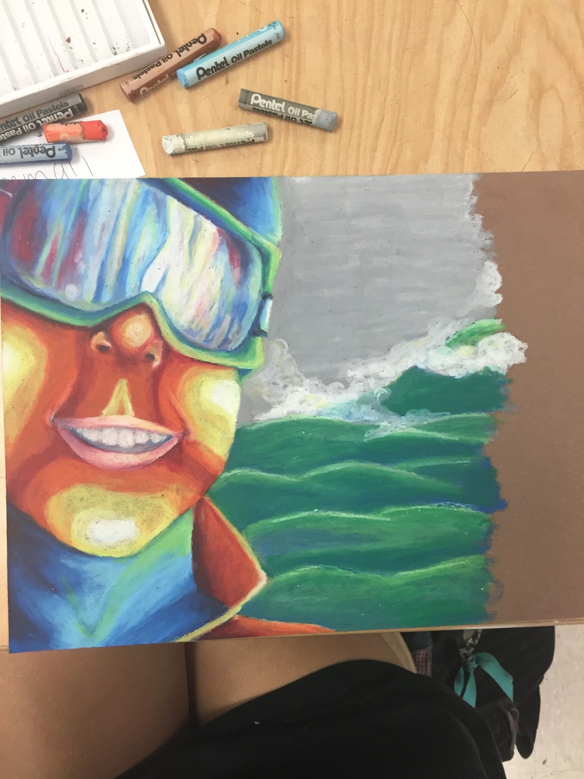
In this project, we had to create a self portrait. I really wanted to use prismacolors for this piece since it would allow me to add a lot of fine details that I think I missed when using oil pastels. I dont really have that much experience with oils anyways, so doing this was really a stretch for me. Learning how to use pastels and combining that with drawing something that I'm not used to really made this project challenging to me. I feel like the face looks warped, and when I drew it I left out a part of the mask near my left eye that would've balanced out the proportion a bit. My lips also look a bit strange and I realised how hard it was to draw teeth using wider pastels and shade them as well. I wish I would've taken my time when I sketched out the plan. The background also looks very rough, I tried to add clouds or some sort of fog in the background but the pastels don't really layer well enough for me to add that and it not look weird or patchy. Next time, I also would've used more colors around the face. If I added more values, I feel like it would've added more depth to the face. I could've used more colors to add more highlights or shadows to make it blend together a little easier. I would also plan the colors a lot better and created a better, more interesting background.
Although this was really challenging, I also learned a lot. I learned to add white as somewhat of a blender much like you would when using prismacolors, and layering the pastels was really key to make the colors work and blend together. I also learned to draw out the sketch first to make sure that your plan is perfect before you try and add oil pastels, which are very hard to remove. If I added too much of a color and I needed to layer another color on top of it, I would remove parts of the color already there with the tip of my nail to kind of scratch away some of the values. I also learned that adding green can really add some highlights to the blues and adding some pink in the clouds can help balance out all of the colors in the face.


Pet Portrait
In this project, we had to create a pet portrait. At first, I had a lot of ideas about my cat or chameleon, but once I began pulling some pictures from my summer internship and I found some more ideas. I began to like this picture of Panama, who was angry at me for not giving him treats so he made this face in protest. It was kind of a challenge to get all of the proportions right on the horse. If I made his ears a little bigger, it would've made him look more like a donkey than a horse. I really had to work and draw straight from the picture in order to capture that horse effect. I also had some problems with the abundance of brown in the photo. The horse was brown the wood was brown and even the whole background behind the horse was brown, so I had to mix up the colors a bit. I really like the red color that I added in the background, because people usually associate red with barns and farm animals. I actually really enjoyed painting this and it helped me branch out from using prismacolors all the time. I realised that I actually like watercolor and I would definitely use them in the future on other projects.
I also had some problems with this painting. It was one of my few times working with watercolor and I didn't really have any clue about how to make the values look stronger. I later figured out how adding less water can really help make stronger shadows or highlights. I also had problems with the accidentaly mixing water oils with water colors. I pulled out a tube of brown and didn't really look at the type until I noticed that it was reacting stringy to the water. When I smeared it on the paper, it looked as if it had chunks of pigment floating around. So that's when I learned to never put anything on a paper unless you know what it really is. I also wish that I would've gotten a smaller brush to help make his eyes look more realistic. The brush I had was somewhat chunky so it made adding finer details hard. I had to result to a gel pen, but I wish I would've had a finer brush at first to make his eyes the way that I really wanted them to be.

This was a drawing that I did for the Prismacolor challenge, were we all had to draw a part of a standard picture that they chose for the challenge. I didn't know that we had to post pictures of these, so I didn't take any in progress pictures. Overall, I had problems with drawing straight from the picture. That one pumpkin on the bottom left looked really weird in the picture so I had to really scrutinize the overall shape of it and its colors. Same thing goes for the gord in the middle. I had to draw weird warts on it and things I didn't quite understand to make it look as much like the picture as possible. I also had problems with the top left pumpkin. It was one of those white pumpkins but I had problems making the values work but not make it look orange. I also drew that before the flowers, so It looks kind of out of place and unshaded. Another thing I had problems was pushing the values on the pumpkins. I tried adding blue or purple, but I already added so much red that the end result made it look really bad. I discovered adding dark browns really worked if you layered it with some blue or purple and helped add depth to the pumpkins. I struggled with the flowers too, because there were just so many of them I couldn't take my time to draw every individual one. I ended up finding some sort of pattern that looked somewhat like flowers to make the process a bit faster and easier. Adding white to the flowers as well really helped them pop. Another thing I had problems with was the wood. I had problems making the values really dark under the pumpkins, so I found that layering brown, blue, purple, and maybe a little of black helped increase the contrast between the wood and the pumpkins.
Through doing this project, I learned that adding some black isn't always bad. I used to only use blues, which was good, but once I needed a really solid black, the blues I used didn't really cut it. I had to try out the dreaded black colored pencil to really make the darker parts as dark as I wanted them to be, and I don't think it made it look too bad. Overall, I really liked this project because it was back in my safety net of colored pencil, and although I've done a good amount of colored pencil projects I learned a lot from this one project.


Landscape Project
I really liked this project, but I want to come back to it later and touch up on my values. The water looks a little bit too light and I wish I darkened up the blue values and really emphasized the reflections in the water. It was hard to try and reflect the mill in the water since blue and brown dont really go together well, so I ended up just adding some light shades of brown into it. I also wish that I spent more time making the trees more vibrant and captivating, as well with the grass. I feel like I could've really pushed the values on everything and I'll probably touch back on it towards the end of the semester. I do like what I did with the mill, but I feel like the shingles on the roof are off in perspective. I always have problems with rooftops and they never quite look right to me, so that'll be something I have to practice in the future.
One thing that I really had problems with was adding too much water on the paper. Sometimes I would be trying to add too many values in one spot and they'd end up all blending together and making a really ugly brown and the paper would start balling together and peeling off. In the future I should try and add less water to the paper and maybe layer the colors overtime to avoid them all blending together. I also feel like I just got lazy with the project and I really wish I hadn't. You can see how the grass got much less defined as you go towards the left side of the page. Same goes with the trees. I also needed to add a definite darker line to distinguish between the grass and the trees to add more contrast and really make them pop.
Overall, I like this piece that I did but I wish I would've given it my all. I like the mill and the colors I used in the trees, but it just doesn't look appealing to me. I'm glad that I was able to paint a place that had a lot of significance to me, though. Every year my family goes to this mill, Mayberry Mill, and have breakfast with my grandparents for my mom's birthday at the nearby restaurant. It's the most photographed spot on the blue ridge parkway and being able to paint it was great!


My first attempt at a concentration piece
This project was really hard for me to do. The paper I used was great for watercolor, but the colored pencils would not blend at all on the paper. I had to add many many layers and even after the paper was filled with the wax of the pencils, I still wouldn't blend. I guess that's the trade off for using all purpose paper. I really had to focus on the colors that I used and try not to use a heavy hand if I was doing a really dark color. I also had a hard time with the boots. I tried to make them look rubbery and have that slick look to them, but also folded in some areas to give them the appearance of being old and worn in. Most of the boots that I used as references didn't have any folds in them, but when I practiced and shaded in the boots like the pictures, it ended up looking very 2-d and not very dynamic. I feel like the boots look a little strange and I wish I would've had the folds continue to the outline of the boots so they'd look more 3-d. The reflections on the boots were also hard since I had to use greens and blues on top with the not very blendable paper.
I wish I would've done all watercolor so I could layer the boots and really shape them to the way I wanted. I also wish I would've focused more on perspective since the boots look way too big. In comparison with the sidewalk. The gutter also looks a little warped in perspective and I wish I would've spent more time sketching and making sure everything looked right. This was my first time doing anything in grey scale, and it was really hard to push the values but make sure to add contrast between different things. I feel like the road shouldn't be that light, but adding anything too dark may drown everything else in the picture.
There are some thing that I like in this picture. I really like the toes of the boots and how I used a lighter shade on the tips of the toes to give them more depth. I also really like the folds in the jeans, its almost like you can see the knee beneath the clothing and I think that's really cool. The tree in the background was also something that I think I did a good job on. I like how you can see the bark and the values around it. Overall, I definitely learned a lot from doing this project even if I don't think the end product was very successful.


Concentration Piece #2
For my concentration I finally decided to do pictures that reminded me of my childhood. This project was pretty fun to do, but it took me a very very long time. I had some problems with the bubbles since I've never really drawn bubbles before. I had to study them a lot and practice a ton before I started my final piece. I also had some problems with how long it took me to do this. Overall this project took me about four days to do. The third one I spent about six hours filling in the bubbles and making them as good as possible. I had to shade every single bubble and I found myself getting lazy and just rushing to finish. I also dont think the background, like the tub and the wall, looks very good, to me it looks very bland and I feel like I could've added more colors to make it look more vibrant. I really wanted to add more tiles but I was running out of time in the end and I was getting a little lazy. I also used a ton of colored pencil and I had problems layering them as well. Next time I should add the colors more carefully.
I do like the colors I added in the duck and in the bubbles surrounding it in the reflections. I also like the details I added in the duck and how I especially focused on the highlights. I think it overall turned out pretty well, but I feel like it could've been better if I didn't rush and spread out my project over maybe a week or so instead of leaving it last minute. I felt like I didn't have enough time and I worked on it too much in one day so I did a sloppy job.
Overall, I learned a lot from doing this project. I learned to spend more time planning the project and maybe sketching it out more. I also learned to not leave things at the last minute and to spread out my time more so I don't feel like I have to rush my project. I also maybe wanted the make the piece more dynamic because I feel like it looks a bit like everything else I do. The layout and the design of this project seemed boring to me and I wish I made more thumbnails. However, I do really like the way it turned out and I really like the colors I used and how they all work together.


For this piece I really wanted to do something that I loved as a kid, stuffed animals. I tried to incorporate a lot of stuffed animals that I played with a lot when I was young to give me more motivation to do this piece. It's not quite done yet since I need a background, but I decided to take a quick break from it so I could come back to it later with fresher eyes. A lot of people said I should put a bookcase in the background or even put them on a bed, but I'm still not sure that I wanted to do yet and I decided it would be best to just come back to it later after I get more feedback from everyone else.
Overall, this piece was really weird to do. I had some problems with the fur as it took me a really long time to do. I wanted to make them look more furry and plushy, but I feel like they just look really hairy instead. I dont think I captured the fluffiness of the stuffed animals and looking at it really frustrates me. I also had some problems with adding black. I usually never use black since its so harsh, but I had to try it out in this piece. Goofy was supposed to be black, but since I was so wary about that color he turned purple instead. The panda in the back is also a mix of black and purple but I really tried to use more black in order to make him actually look right. I also dont like how I had the panda and the bunny so close to eachother. I feel like they somewhat clash because their colors are so similar and it sucks I didn't notice it until after I had finished. Another thing I don't like about this piece is the bear. I feel like he looks a lot like a koala since his nose is so high and it doesn't look like the picture at all.
Overall, next time I think I should sketch more before I draw. This would ensure that the perspectives dont look so strange. Also, I think I should plan more before I do a piece so I won't get stuck with the background like I did here. I thought I would come up with something as I was working on it, but it only made me more and more stressed out. I also should use different paper next time, as I used paper that's not really meant for prismacolors and you can really see the grain in the paper if you look closely. In order to make the bears look more fluffy, I think I should focus more on smaller strokes and maybe try to add strokes that are not all going the same way to give it more depth and dimension. Overall, this project was okay, but I still see a ton of things I could've done differently and I dont really like the way that it turned out.


This piece was really fun to do but really hard with the medium I was using. I wanted to do something that I really enjoyed as a kid and that would mainly be sailing. These are the boats that I first learned how to sail on in Oriental and it was really awesome to be able to paint them. This piece was really hard for me to do since I never really paint. Of all of the pieces that I've worked on this year this one by far took me the longest, I practically worked all weekend on it since whenever I paint, I always see small mistakes that I would like to fix, and then when I fix it I mess something up in the process. It's quite frustrating.
I think this piece turned out okay. It's not my favorite, but it was really hard to get the perspective right with all of the boats. I had to spend a lot of time sketching everything out and using a ruler to help me make all of the lines straight and make all of the boats look as uniform as possible. To me, all of the boats look wonky and out of place. I feel as if I didn't do a very good job sketching them and the perspective doesnt look quite right. I hate how some of the boats look fatter than others, or some look longer or higher than theyre supposed to be. I also really dont like the bottom right boat that kind of blends in with the grass. I wanted to make that one orange, but I felt as if I had too many orange boats and not enough of green ones. In the picture it was gray but I was just tired of doing gray boats. I also don't like how some of the wood frame got a little wider since I kept going over it, and I feel like I really rushed with the grass.
Overall, theres a lot about this piece that I really don't like, but I feel like it was somewhat sucessful since I almost conquered my fear of painting. Next time I should take my time and take it slow before I jump into a painting, and I should also plan out my colors before I start. Upon doing this piece, I learned to just go for it. Even though all of the colors arent quite blended, I tried to let myself go this piece and not worry too much about making everything perfect. Sometimes I added a block of color and I ended up liking the way it looked- everything doesnt have to be blended all of the time when you're painting. I feel like this piece really helped me understand my painting style and got me on the right track if I ever wanted to paint again.


Concentration #5
Although my concentration is my childhood, I tried to add some more unconventional times that I had as a kid to make my concentration a little more personable. I wanted to make something that really shows how I grew up, instead of the general population. This sailboat was really hard to do because of the perspective. I found it strange to draw from this point of view, and I really had to sketch it a lot in order to get the perspective correct. I also had some problems with the colors in the picture. I feel like there was too much blue and doing the cabin made me feel like the blue was just overwhelming.
I struggled a lot with the water. I really wanted to show movement in the water and how the water kind of flowed with the tide- I didn't want to make it look dead. I tried to add a lot of these movements and adding plenty of values, but I feel like it just ended up looking murky and strange at the end. I also really struggled with the colors in the boat, since they're mostly tan and white. In the picture, a lot of the boat is very white due to the sun, but I really wanted to show the details in the boat and I felt like making it all white would've been very confusing. I also feel like I could add more values into the sail to make it look like there was wind. The part I dislike the most about this picture is the cabin. In the picture it was completely black, but I felt like black would've been too harsh. I had to resort to using different blues and purples and that is personally my least favorite part of this piece.
Next time I think I should plan my colors a little more carefully. I feel like I was trying to rush this piece and all of the blues makes this a really weak project in my mind. I feel like everything blends together and nothing really stands out. I also think I should work more on my techniques with water since I feel like the water looks very bleak and still. Overall, I think this is one of my weaker pieces and I wish I would've spent more time thinking about the colors before I started it.


I really wanted to do a piece that showed how much I loved gaming as a kid. Although I feel like I could've done this better, I still really like the colors in it and I like how they all work together. I also really like the small details I added with the gel pen since I think it makes the brighter highlights really pop to make the piece a bit stronger and almost give it a more playful feel. I also really tried to add a lot of purples and blues to emphasize the highlights and I ended up really liking it. I also like all of the shadows I added under the cards to make them almost come off of the page. I actually didnt mean to add purple to the gameboy color, but I like how it works with the blue in the device, I feel like it helps make it pop.
There's many things I would change about this piece. I don't really like how the game cards are kind of warped and I wish I would've used a ruler to make the lines more straight and uniform. I feel like some of my lines are kind of wonky and doesn't look quite right. I also wish I wouldn't have gone so small because I had a lot of trouble adding really small details to the game card. I couldn't get my colored pencil sharp enough to add the small words that were on the card or even the logos on it, and I feel like if I could've added it, it would've made the piece a lot better. I also wish I spent more time working on the carpet. I feel like it just looks like a fuzzy ground instead of actual carpet.
Next time I think I would've gone bigger so I could've added larger details or maybe even use a gel pen. I also would've used a ruler to make the lines look a little bit more uniform so the perspective wouldn't be a little thrown off. I would spend more time working on the carpet and maybe add some carpet coming around the games to give the ground a little more depth instead of it looking so flat. Overall, even though there is a lot I messed up in this piece, I actually kind of like it because I love the colors and how they work together.

I did this piece because I played with trains a lot when I was little. This is my old train set and I really had to dig around the attic to fish it out for this photo. I feel like this piece was somewhat successful, but I used the wrong type of paper. This made using prismas a lot harder. I had problems layering the colors, especially yellow and the brown I used for the rail road track. I feel like this piece doesn't quite fit with my other pieces and you can kind of see where I gave up in this piece.
I really like the highlights I did in the train and the bridge. I also really like the ferns in the background and the shadows I did on the blue tower. The wheels on the train took me a really long time and I actually like the way that they turned out.
I wish I would've used a ruler when I did this piece. I didn't really plan and just kind of went for it, and you can really see the messed up lines in the background of the piece. I also had some major problems blending the yellow blocks. I've never really had to shade yellow before and finding a color that would act as a shadow of that pallet was pure death. I tried orange but that just made it brighter, and the brown I ended up using didn't blend well with the yellow. I had that same problem with the track. I feel like I couldn't quite find the correct colors that would compliment the track and you can really just see the strokes of the pencil that I did. I also hate the background picture on the wall. The building was supposed to look more realistic, but I feel like it just looks like a child's artwork in the background. Overall, I feel like this piece could've looked a lot better if I had planned more and spent some more time on the background.

Concentration #8
I did this piece because of my Asian heritage. It really helped shape who I am today. I have pumpkin seeds, the Taiwanese flag, red envelopes, and flowers. These are all things that helped make up my Chinese culture. It took me a really long time to photograph this picture because I thought way too much about the composition of the piece. I second guessed myself a lot and I tried tons of different pieces and placements of everything before I got this final product.
I think this is one of my weakest pieces. I really don't like how I messed up the envelope perspective. I feel like it is somewhat warped and doesn't quite look right. I also don't like the seed. I feel like there's no dimension even though I added tons of shadows under them. My least favorite part is the flowers. They're very 2-D and do not look good at all. They do not have any depth and I barely added any highlights to them.
If I were to do this piece again, I would really work on the perspective of the envelope before I started coloring it. I also would've spent more time planning out the seed bag and the flowers around it. I would've added more color to the flowers and added more shadows and highlights, and maybe exaggerated the shadows under the seeds to help them stand out even more. I would also maybe take a gel pen and to add the highlights to help things stand out a little bit more. I also would've spent more time on the wood behind the bag. It was originally granite but I thought wood would look better. Overall, this is a really weak piece. I feel like I almost was too lazy with this piece and I could've made it look really good if I just took my time and really focused on all of the small details.

Concentration #9
I did this piece because I feel it really captures my sense of adventure as a kid. I loved fishing when I was little and I was constantly fascinated by the ocean in general. I used to fish for hours on end and my dad almost had to pry me away from the fishing pole. I took this picture in my dad's garage and later added the wood. I originally had lures in the casting net which was really annoying to get out, but it was worth it to get this picture. This piece took me a really long time to photograph because I just had so much fishing supplies. I really had to pick out the few things that I felt went together and get them together in a photograph.
I really like how this piece turned out. I love the net and I love all of the colors I put into the lures and the highlights I put into the bobbers. I also like how I put the saran wrap over the fake worms. The overall composition I feel was really effective and it really led your eye all around the piece. I wish I could've cut off the top part of the piece a little bit because I almost feel like the net is a little bit overwhelming and takes up most of the piece.
Next time, I would add more shadows under the lures and the package of worms to add some depth and maybe added some more purples to the wood. I would also do the wood before the net, as it was really hard to do the wood under the net. I also would've done the fish first as well since they look kind of funky under the net, they don't look real at all. Overall, I really like this piece and it is one of my favorites. I love the composition and the colors and I feel like it is one of my best pieces in my concentration.

Concentration #10
For this piece, I did my uncle's old hot wheels. This was really a piece I needed to do for my concentration because I loved playing with hot wheels when I was little. I kind of did this in memory of my uncle since he passed away and I really wanted to do a piece for him.
I did this piece over the spring break. I really like the highlights that I used in the cars and the different shadows under the car to make them look more shiny. I also like the variety of colors that I used because I feel like your eye kind of moves all around the page. I also like the jeep in the back. I like the colors that I used in it and I feel like that one car really stands out from the rest of them.
Next time, I would really plan more. I feel like I rushed to finish this piece and I realized how much I do not like drawing cars. Their proportions were really hard to maintain and I had tons of trouble with the windshields. I wish I would've planned the colors more too. I really dislike shading and using yellow, so making the focal point of the picture yellow was not that good of an idea. I also wish I would've spent more time on the wood since it just looks flat and unshaded. I also would've spent more time on the wall, since that color of blue doesn't look quite appealing and it did not like going on the type of paper that I used. I also wish I spent more time on the picture frame in the background. I feel like the picture frame looks very poorly done; like I rushed. Next time I will plan my piece more and the colors. I would also look at more cars and practice them more and not rush as much to finish this piece.

Concentration #11
I really wanted to do this piece because my cat was a really big part of my childhood. I've had her since I was three years old and I feel like my concentration wouldn't be complete without her. I did this piece on orange paper, because I wanted the viewer to get a sense of warmth from the sun and the happy demeanor of my cat. I'm very glad I did that because I was able to quickly do the wood grain by letting the orange somewhat shine through. I also love the texture I put into the cat and the shadows on the house siding. I also like the purple I put in the cat to enhance the shadows and add some depth to the piece.
I wish I would've spend more time on the perspective. I feel like it is somewhat warped and the cat looks too big for the background. I also wish I would've spent more time on the wood on the left side of the piece since it looks bendy and not really straight. If I was able to do this piece again, I would've fixed the perspective and maybe fixed the cat's muzzle since that looks a little bit too long. I feel like it doesn't look quite like my cat due to the longer face. I also would've changed the color of the curtains because I feel like the blue doesn't quite go with the color scheme. I wish I would've made them purple as it would compliment the orange in the wood.
Overall, I think this piece was pretty successful. Even though there are many things I would've improved, I still really like all of the colors I put into this piece and how much time I spent on the fur. This was the first time I really let the background color of the paper I used shine through my art and I think it turned out really well. It almost gives it somewhat of a glow. I also like the green leaves I put behind the railing because its gives a small pop of color that I feel really bring everything together.

Concentration #12
I thought this was a good choice for a final piece. In this, I have my old house in the background for sale and my graduation tassel hanging by the mirror. I also have the interior of the car I used to move stuff and my street in the background.
I really like how I did the house. It was hard to get all of the lines straight, but I think it ended up really looking like my house. I also like the interior of my car. It was hard to get the right pigmentation right of the car seats, but I think I handed it somewhat well. I also like the trees and the slight distortion of the windows from the car, as well as the values on the tassel and the little flip thing on the window.
Next time, I would've taken more time on the background of the piece. I feel like I really rushed the trees and the stop sign looks a little silly. I also would've added more values to the road because I feel like it isn't just grey. I feel like there should be much more black in the piece but I still wanted it to stand out from the mirror. I also would've made the interior of the car more interesting, maybe adding more boxes and color into the back of the car since it is all one color. Overall, I feel like the piece is kind of boring. I used the same colors throughout the whole thing and I got kind of lazy with the background. I really wish I took more time and maybe added more houses in the background instead of doing just trees. I also would've added some gel pen to the house to make it stand out a little bit more, as it kind of blends in to everything else. I like the idea, but I feel like I poorly executed it.
REFLECTION
Overall, I gained a ton through this class. I learned that I loved prismacolors, and I explored many different mediums. I learned that painting isn't all that bad, and oil pastel can be fun if you're not doing a face. I rediscovered my love for watercolor and I even explored different types of mixed media. I also learned that doing small pieces isn't always good. You can't get as much detail in the pictures that you can by using larger pieces. Everyone in this class was so supportive. They'd help you see things about your piece that you didn't see before. This really helped me notice just how much your environment can impact your art. I was much more motivated to do art once I was with the group rather than when I was just in drawing or at home. I also learned how to make effective compositions and harmonize colors. Prismacolors can be difficult sometimes, but after this class I really learned how to use them effectively. I also was introduced to gel pen. I learned that this creates vivid highlights and can really bring some of the items in your piece forward. Adding the gel pen really made a huge difference. Looking back, this class helped me become a better artist. I learned many different techniques about different types of mediums, as well as find my own medium. I found my style of artwork and developed a color scheme that I was comfortable with. This class helps new artists really discover themselves and get them prepared for college and future work in art!
No comments:
Post a Comment