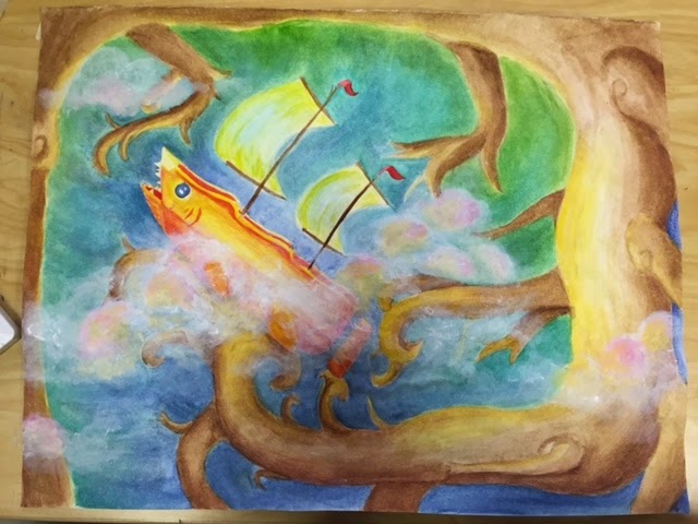
Surrealism Project


Did you learn new techniques or processes as part of the work for this project?
Yes, in order to do this project I had to really learn different types of mediums and how to use them together to make a piece that would work. In this piece I had to use watercolor, acrylic, and colored pencil. The colored pencil didn't really work because the wells in the watercolor paper were way too deep for me to actually get the color into the deeper portions of the well, so it ended up looking really granulated and splotchy. The watercolor is what I mostly used for the whole piece and I ended up using acrylic paint to finish up the clouds, as you cannot use white watercolor. I really had to learn how to balance these values to make them work together.
When did you step back and analyze you work during this project?
I stepped back and analyzed my work about once every 10 minutes because I had to make sure the water color was even all around the painting. I constantly had to make sure the values made sense for the shadows that I was intending on making, and that one side wasn't too dark or one side wasn't too light. I had to step back and look during the clouds stage too, because I needed to make sure that all of the values blended into the watercolor background and that the highlights in the clouds were properly blended. I also had to step back at the very beginning when I was sketching out my plan, to make sure the boat wasn't completely in the center to make a more interesting composition. I also had to keep an eye on the contrast, and really tired to make the boat pop in front of the dark blue/purple background.
Did your work take an unexpected turn due to a mistake or did something happen that was unplanned?
Yes, because I mainly planned on most of this piece being mostly watercolor, with maybe some accents with the colored pencil, but when the colored pencil didn't show up as well, I had to mainly rely on the watercolor. It was quite a large expanse of area to cover with just watercolor, so I had to make sure to even out the values when I had to do the sky and the trees. I kind of had to cope with this and add highlights with yellow watercolor instead of white or yellow colored pencil. I also had many instances where I added too much watercolor to a certain area, and had to dilute the watercolor by adding more water to the area to spread out the value and contrast.
Scratchboard Project


Some of the issues that I encountered when I was doing this project was the problem with making sure that all of the values were accurately portrayed. I had some problems making sure that the values were very gradual and tried to add as much depth to the scratchboard as possible. I didn't quite know how to shade the scales since they're all very round, so the process of scratching off little streaks to make each value was a very lengthy process. I also had some problems trying to create a good composition that made it appealing to the eye. I couldn't do just one fish, but many overlapping each other to make it a little bit more interesting, while making sure to not have anything directly in the center of the scratchboard.
I constantly stepped back and looked at my work when doing this, because when you're scratching off the values you don't quite see how much of a difference it makes until you step back and look at it. Each gradual scratch really makes a difference in the end to help make a nice contrast of light and dark values that will make the piece really pop out and make an impact. As I stepped back when doing this, it began to look more and more like actual fish in the water because of the values that were being added.
The knife was also another problem that I had because it was hard for me to find a nice spot on the knife to use that would gradually take off the black. Some sides of the knife took off too much while others didn't work at all. This was my first time using scratchboard so I really had to get used to using the tool, besides when I used it for the stencil project in art 1. I constantly had to change the pressure I put depending on how light or how soft of a line I was trying to make, which did take a while to get used to. I also had to make sure that my hand wasn't too far down on the knife so it wouldn't cut it.
Distortion Project


I had some problems with the direction for me to color. This can kind of be seen at the middle of the picture with the water and the highlights. I tried to do a graduated blend but I didnt realise that the directions were conflicting until I had already reached that part. I don't really like the way that that part turned out so I tried to cover it up with more colors to try to hide it. It still doesn't look the best and if I were to do it again I would change and be more aware of that. I also wish I would've added more white towards the right side of the mouth for the cat, I somewhat rushed into it and I wish I would've planned more.
I constantly looked back on my work to see if it truly looked warped in some places. I always had to look back and see if it truly looked like it was in a different perspective; I didn't want it to look like just a regular picture. I also always asked the people around me if it really looked like it was a warped perspective and got feedback from them on my technique. The feedback really helped me get a different view on my work and helped me see it differently.
CLAY


I constantly looked at my kangaroo throughout this project to make sure that everything was symmetric and the feet were not too long. I also had one mishap where the kangaroo's leg completely broke off and flew across the room. I had to glue it back on and put a small tape cast on it to help it mend. The next night I took off the tape and it was back to normal. I never really knew how useful tape and glue can be when working with clay!
I had some troubles with the fur, since I had to constantly make sure my hands weren't pressing it down too much. The same thing happened when I was painting the animal. I pretty much always got some white splotches on the kangaroo's back or other places where the white splotches shouldn't be. I also had to watch where I added the colors, since I wanted to add some highlights like I would in a painting, but I didn't know if I should for a clay kangaroo. I did anyway to add some depth to the figure and make the color more rich in some areas than others. I'm actually pretty proud of the final outcome!


Reflection Painting
When I look at this artwork, it surely didn't turn out as I thought it would. I really wanted to make it look more dilapidated and run down; kind of eerie and creepy. I also tried to make the fog in the background more prominent and closer, but it was really hard to make a wash that didn't look strange on the canvas. I wish I added more values to the girl, and maybe added a face to her and bring her more forward, but I later decided that a faceless person might be a little more creepy and lead the eyes more to the mirror. I also wish I had a steadier hand to make the reflection stand out more, a little more detailed and brighter compared to the darker colors in the painting to create more contrast. I could've added a lot more details in this painting, and I might later on in the future. I really like the whole idea that I had, I just wish I would've carried it out a little bit better and had been more careful when painting my lines.
I constantly stepped back and analyzed the work, because with a very straight roller coaster like so, I had to make sure it looked real. I always had to step back and check to make sure the roller coaster looked correct, and that my lines were straight enough. I also think I could've added the bars that lead around the circular part of the roller coaster, as many have those to support the offset weight. Instead, I just did some poles by the bases, which some older roller coasters have instead. If I did this painting again, I think I would probably add the bars coming around the coaster since it would've made it look more real.
I really learned some different techniques when I was doing this. I learned to add more values and see more colors in the places I really didn't before. I also learned new ways of painting straight lines, and adding the effect of fog in the distance. One thing that I tried to incorporate in this painting was that the sky is a lot more white than blue. Usually when I paint skies, it usually comes out as a darker blue than what the sky really is. So, when I was doing this painting, I tried to make the sky lighter, partially because of the fog but also because I wanted to make it look more realistic. I think I'm going to continue that in later paintings as well.
Landscape Painting


This painting was a little bit of a challenge. I tried something completely new when painting the background of the painting orange before adding any sort of color onto the canvas. That was really different, and I can see how it makes the color pop at the end and adds some texture. I still should leave some of the orange showing towards the front of the painting, since it would've added a lot more texture. I also struggled a bit with the oils at first, I added too much of the thinning liquid which made the canvas really goopy as you can see at my clouds. I've painted with oils quite a bit, and the ones that we used initially were nothing like the ones I was usually used to. It was really hard to spread and made it hard to paint over.
I really like the clouds that I have overhead, it's a new way of clouds that I've never tried before but I like all of the values and how they kind of swirl around, even though that's really not the way that clouds look like in real life. I also like the grass values that I added too, I tried to add as many colors as I could. I would've darkened up the barn a little bit, and added more detail which I probably will in the future. I would also try to make the metallic roof a little bit more reflective of the darker sky by maybe adding some dark blueish grey to the white. I would also add a lot more details to the house, but it was really hard since my hand was constantly getting messed up in the green grass. You can kind of see my palm print in the upper right hand corner where my hand pressed up against the canvas and left a mark. I couldn't really fix it since it was very hard to find a color that matched the sky, and I was afraid it would mess the sky up.
Once the paint dries well, I will probably add more details to the house. Probably darken it up and make it look more straight, as it kind of looks slanted when you look at it straight on. I probably should've stepped back and looked at my work more to fix that. I was always really close to the canvas to try to fix the small errors I found. The next time I paint I should really step back frequently to make sure everything looks correct. I really gained a lot of experience with different kinds of oils, and I learned a few skills when working with them. I learned to not place my palm on the canvas because it'll probably be wet paint, as well as how to do a new type of cloud!
No comments:
Post a Comment